
What should brands consider when deciding on a label?
The strength of a label is defined by the market sector that the product is aimed at.
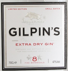
A label going on a vodka mix is going to have different requirements to that of a high-end gin label, and different again for the real ale brigade.
The only real rules for producing a strong drinks label are:
- Be completely different.
- Production must be of extremely high standards
- Get it on the highest quality substrate you can afford
Amongst the cluttered shop shelves the companies with staying power are those that have created something unique, different and properly targeted at the right demographic.
Involve the printer at the same time as the designer and brand manager and the creative process will be better and quicker. Printers can advise on how things come out on certain substrates or how to go about building the layers of the design for optimum impact. They will also have an understanding of costs and how to leverage the most out of the budget.
Lean on them. They should be the one setting the standards and they should be exacting. Your brand is everything and everything about your brand is reflected in the quality of the print on your label.
The material is a significant part of the cost of your label. Getting it on the wrong substrate is a killer. Anywhere between 50% and 65% of the cost is going to the substrate. Too often time and money is sunk into the design and it’s the material that’s sacrificed. The look and feel of the material is inherent in good design and should be used to enhance the product.
|
How do you achieve stand out in an overcrowded market?
It’s a cliché but make your brand different. For inspiration the drinks market should look at cosmetics, beauty or hair products. What can you borrow to enhance your product? I once took a call from a spirits client at 7.30am. The guy explained that he had seen a foiling technique on his shampoo bottle that he wanted to incorporate in to his spirits brand. That finish now enhances that particular brand very nicely.
Think about using the whole face of the product. Too many labels only work when the purchaser is face on. Grab their attention as they approach and pass the product and you’ll have a better chance of getting picked up. You can do this using holographic foils and materials.
The trend remains for subdued or dirty colours. Matt varnishes are prevailing in terms of feel.
At the value added end of the market we are seeing a move back to bright foils. Embossing is also popular.
In beers we are starting to see designers using metallic papers to create some good movement in the design, and finally an end to the simple yellow wash to create a single gold text.
Different designs will demand different materials. All the paper manufacturers are eager to get a stronger hold in the drinks market. The leading supplier in terms of innovative and effective materials is Manter who supply the Fedrigoni material range. Fasson and Raflatac also has extensive materials for drinks ranges.
Think about what you are prepared to pay to get the material you yearn for. Spend time looking at samples. If it’s out of your price range then compromise, there will be a standard range, which may not be exactly what you want but there should be standard material in the same family. Remember different print methods will react differently, on different substrates. Be guided by your printer as to what works well.
The potential to talk endlessly about what can’t be done is huge. The reason printers have a bad reputation with some designers is that they can be too prescriptive about what can’t be done.
There are limitations but with ingenuity, compromise and effort our experience is that most things are achievable. The greatest factor in not achieving the required outcome is often time. An early start allows for technical trials and research to be done while the design is being finished.
How do you re-brand without loosing the essence of your brand?
All the successful re-brands we’ve been involved in have had one thing in common they are evolutionary not revolutionary. Themes and colours must be continued. A recent re-brand saw us changing the material and the style of printing to give a much more exclusive look. While all the key elements such as typeface, logos and colours remained largely untouched. The impact was amazing but done in such away that consumers would not need to be re-educated to the brand.


