-------------------------------------------------------
AT FIRST SIGHT LIQUEURS IS NOT THE MOST INNOVATIVE AND VIBRANT CATEGORY.
To an outside observer, it has been stagnant for some time. The exaggerated sweetness of liqueurs makes them somehow less noble than spirits, and often that seems to be mirrored in the packaging. Moreover, a high abv content means their destiny is often to be diluted.
So as brand designers, we asked ourselves, what do liqueurs have to do to be successful and relevant today? What are the exceptions and what do they do differently? What is the recipe for success to make a new liqueur more than a traditional cocktail ingredient but a brand in its own right – or even a benchmark in the spirits category? What makes a liqueur megabrand, with a ritual it can own, and an identity that remains intact even when mixed?
Creating or recreating history
Established liqueur brands have a weighty heritage making them the ultimate reference component, rather than a regular mixable spirit drunk throughout the year. They are not necessarily expressions of their ingredients and most people don’t really know they are drinking a liqueur. They are drinking a brand, and they are blissfully unaware it has category cousins. Liqueurs follow their own code and traditions; the faux nobility comes from brand stories and 100-year-old secret recipes.
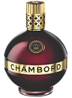
Chambord embodies the archetypal monarchic aesthetic, as if it were an ornament borrowed from the French château, thus embodying its brand DNA perfectly. A 320-year-old recipe, one of Louis XIV’s favourite drinks when he used to visit Chambord, but on the other hand a very feminine and quirky advertisement campaign with the ‘Frenglish’ strapline: Because No Reason. This balance between premium heritage and modern wit gives it some relevance to today’s world – premium but accessible.
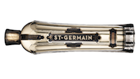
However, a liqueur doesn’t have to be around for centuries to be classic and credible. St-Germain Elderflower liqueur was introduced in 2007 by the American Coopers Spirit Co, yet its beautifully crafted bottle design grounds it in 19th century French Art Nouveau in both a contemporary and authentic way. Even the point-of-sale displays, designed to look like fine Empire cabinets more than the usual awkward cardboard gondolas, contribute to the brand storytelling.
Masculine or feminine aesthetic
All liqueurs contain added sugar and a high abv, yet certain flavours such as red fruit, vanilla, cream and vodka tend to be positioned in a feminine way and others, such as coffee, whisky or spices, positioned for a more masculine market.
St-Germain is made from flowers that are gathered in a time-honoured artisanal way from the hillsides of the French Alps. 
Despite its floral bouquet this liqueur is definitely positioned to go beyond gender stereotypes, as a new classic. If you didn’t know, you would believe it’s been around French bistros forever. Praised by The New York Times in 2009 for having “almost single-handedly invigorated the moribund liqueur category”, the crafted bottle design and branding played a big part in making it a game-changing liqueur.


